Arc browser review - redefining the way I browse the web
After a few months, I can draw my conclusions on this new and unconventional browser
Wednesday, August 23, 2023
For several months now, I’ve been using a different browser.
It’s called Arc, and it promises to revolutionize the way we browse online.
Apart from all the initial hype, I must say that… it’s true. Arc is the best browser I’ve ever used so far, and going back is no longer an option.
What I Like About Arc
Arc presents itself with a minimal and clutter-free style. It was initially designed as a browser for MacOS (and unfortunately, it’s still only available for MacOS and iOS), so it’s natural that the creative team behind Arc sought to create a UI that perfectly aligns with the Apple environment. And they succeeded brilliantly.
I’ve always been dissatisfied with the lack of harmony other browsers had on MacOS. Somehow, none of them integrated seamlessly with the MacOS UI—except, of course, Safari—but given the work I do, I need a more flexible browser, and a Chromium-based browser allows me to develop on the platform with the widest market share.
Arc, however, is different, and I use it with the same visual satisfaction I would get from Safari, but it’s based on Chrome.
For me, it has already earned 1000 points. But it doesn’t stop there.
The UI might be surprising at first, especially after years of using tabs positioned at the top.
In Arc, the tabs are in a sidebar, arranged in columns. You can “pin” the tabs just like you do in other browsers, but here’s where Arc reveals its cards: you can divide your work into “Spaces,” and each space will have its own separate list of tabs. Additionally, you can pin tabs that should always be accessible from any workspace.
This navigation workflow is truly revolutionary.
You might say, “Well, you can do that in Chrome, and even in Firefox.”
Yes, you’re right, but not as well as Arc does it. Arc is smooth and visually satisfying. The UX of Arc is incomparable to the pinned tabs of other browsers.
Continuing with the UI, Arc appears minimal, giving the web page you’re visiting all the space it needs. Once you hide the sidebar, you’ll have a window with only subtle borders and the page filling up all the space.
But what about the address bar? It’s located in the upper part of the sidebar (you can make it fixed at the top, like in other browsers, but personally, I keep it in the sidebar).
There are other UX elements I could talk about, but they blend together with the fantastic features this browser has. So, maybe it’s better if I start listing the features that made me fall in love with this browser, to cover everything comprehensively.
Arc’s Features
The Sidebar

I’ve already mentioned it, but let’s delve into the details.
Arc’s sidebar is the heart of navigation management. In the sidebar, you’ll find the address bar (with superpowers) and the tabs.
The tabs are divided into three main groups:
- Open and unpinned tabs: these tabs will be automatically closed after 24 hours. Every time you open a new tab, it will appear here.
- Pinned tabs in the space: these tabs will always be present in the sidebar but visible only within this space.
- Pinned and always-visible tabs: these tabs (which also change their appearance, becoming icons) are always visible, even when you switch spaces.
Spaces
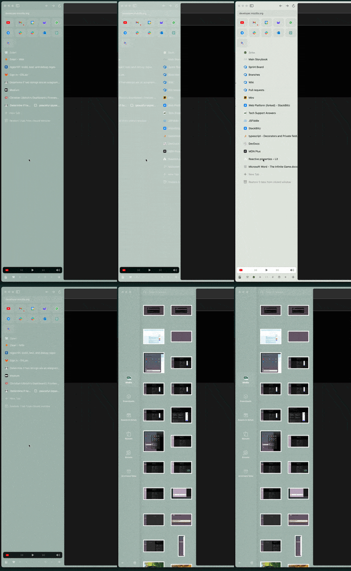
The sidebar has a horizontal scrolling mode. You can scroll left and right with the mouse. Scrolling to the left will take you to the space where downloads and the latest saved or used multimedia files, downloads, space management, boosts, and easels are visible (we’ll get to them shortly).
You can add Spaces, which are independent workspaces with their own tabs (pinned or not). This allows for fantastic tab organization, not just grouping them together (you can also group them within folders and subfolders) but also grouping them by workspace.
This way, you can separate tabs and websites for work from those for personal use. You might add a space for a side project and save all the tabs you need for it there.
They’re like favorites on steroids.
The Search Bar
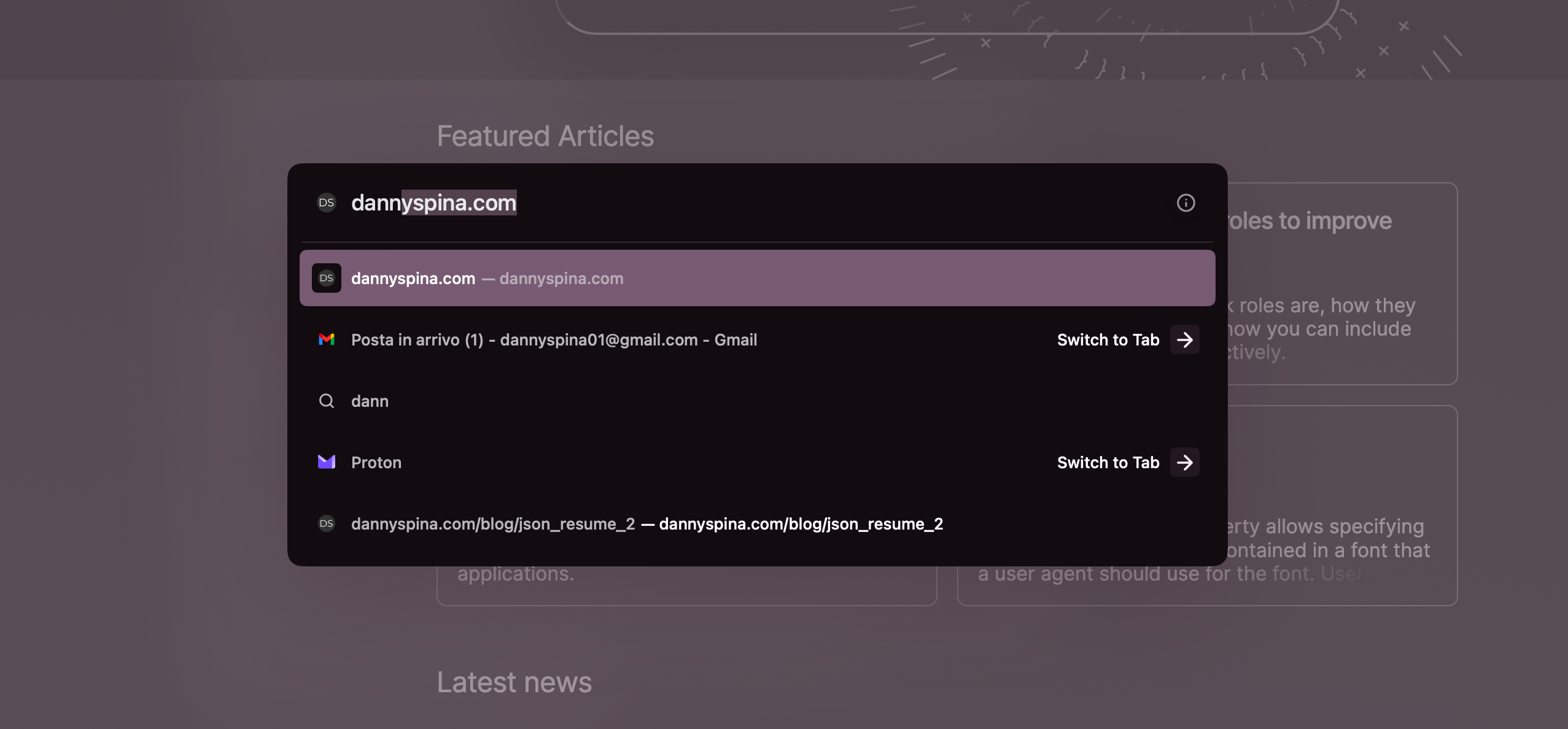
It’s very similar to macOS’s spotlight bar, activated with command + T (the combination normally associated with opening a new tab). From here, you can perform a search or use Arc features like the split view.
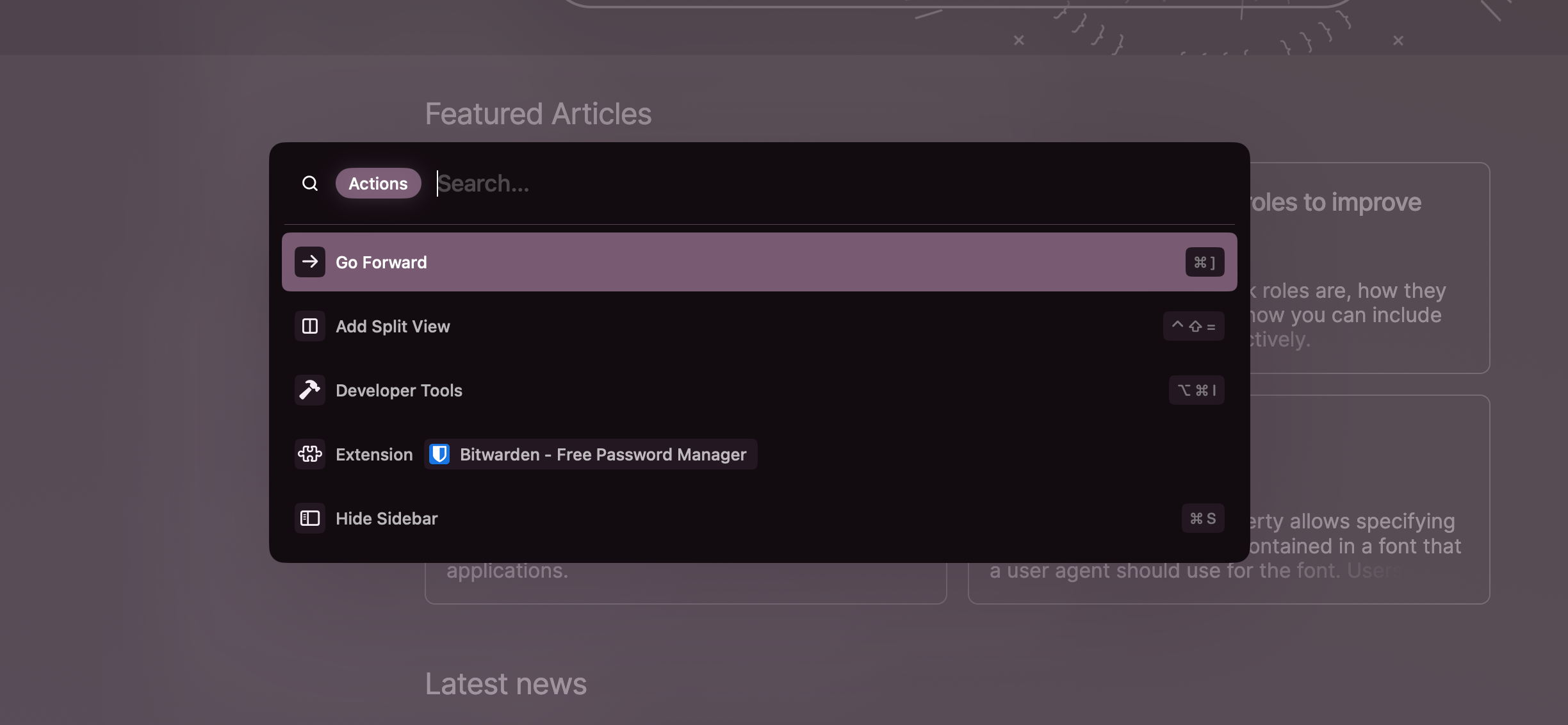
Pressing the Tab key enables the actions mode to give you an overview of actionable actions from the bar, making it easy to search for and activate them.
Easels
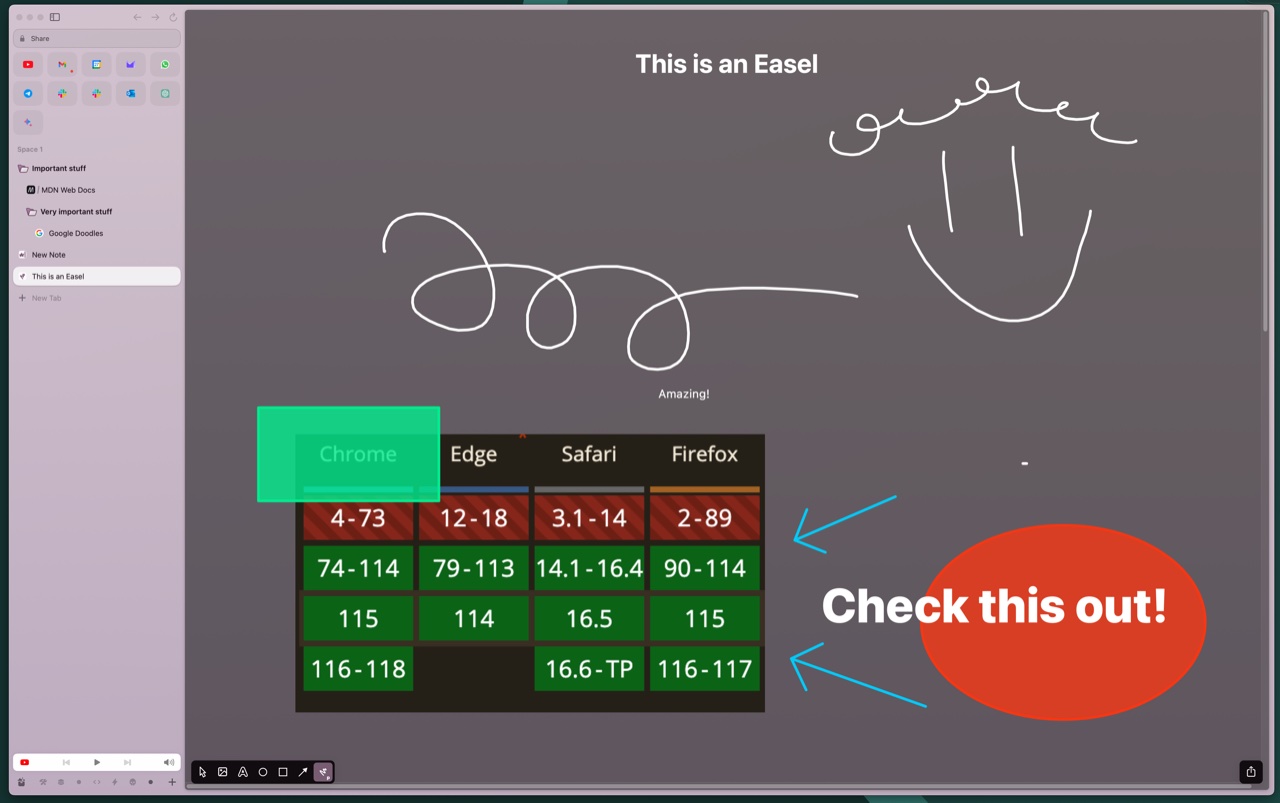
With Arc, you can create notes in an infinite canvas and share them as if they were web pages.
Inside the easels, you can write text, freehand draw, insert shapes, and even add screenshots of web pages (which will be clickable and lead to the actual web page).
These notes can be managed just like tabs, so you can pin them, organize them into subfolders, etc.
Boost
The boosts in Arc are browser extensions that you can generate with a couple of clicks.
The idea is ingenious.
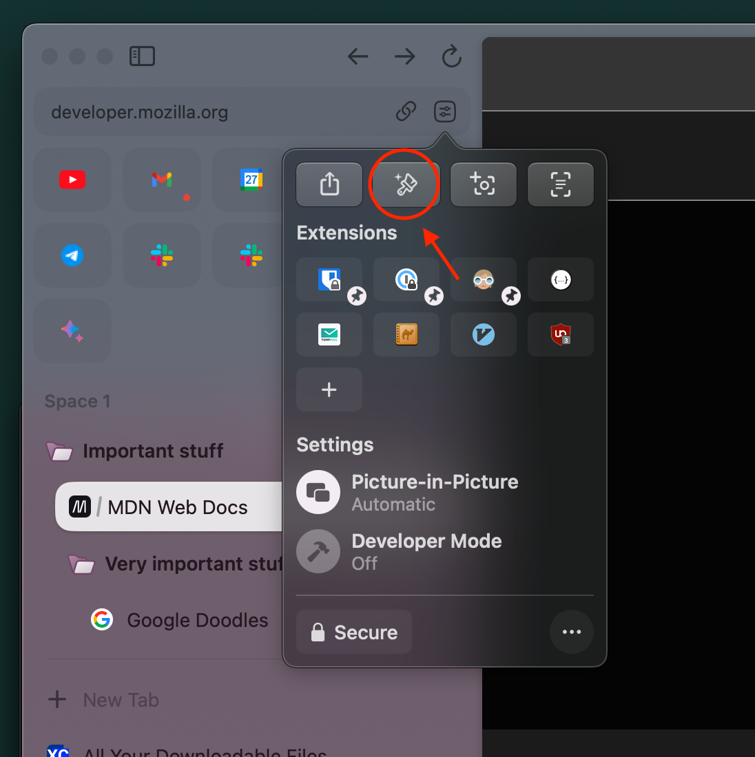
By clicking the Boosts button near the URL, you can modify and customize the user experience of a web page. You can change colors, hide elements, and even write your own JavaScript and CSS to inject into the page.
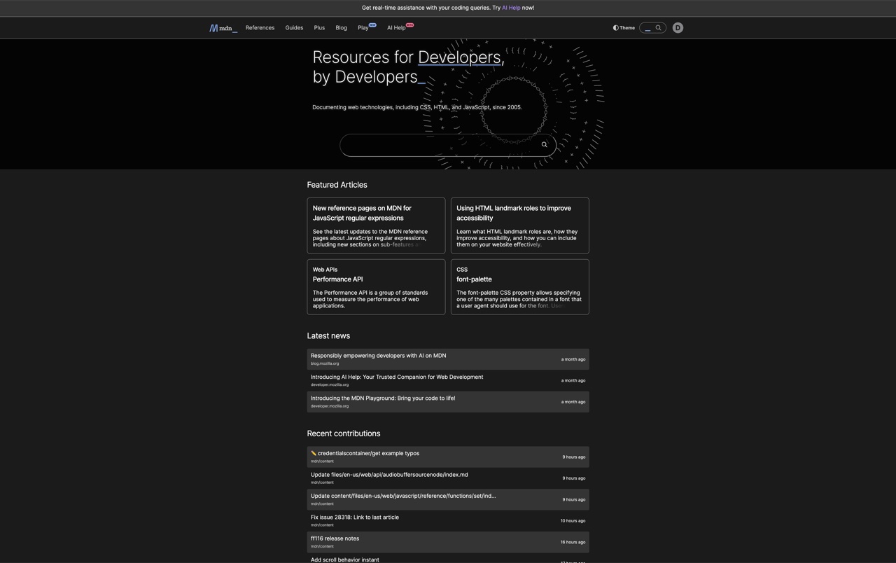
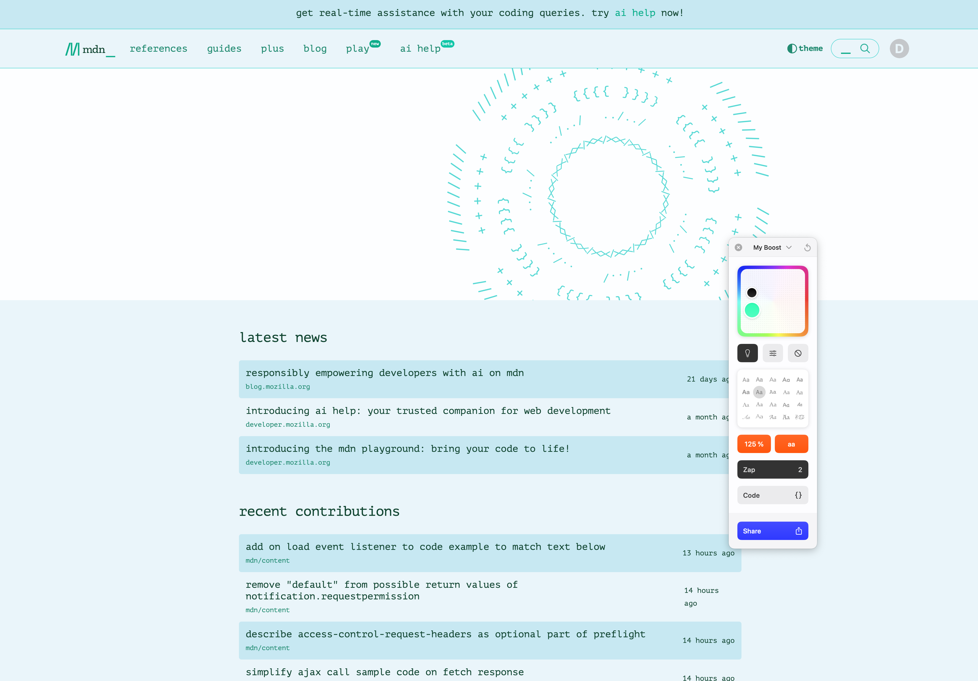
Boosts can also be shared (if they don’t contain JS).
Split View
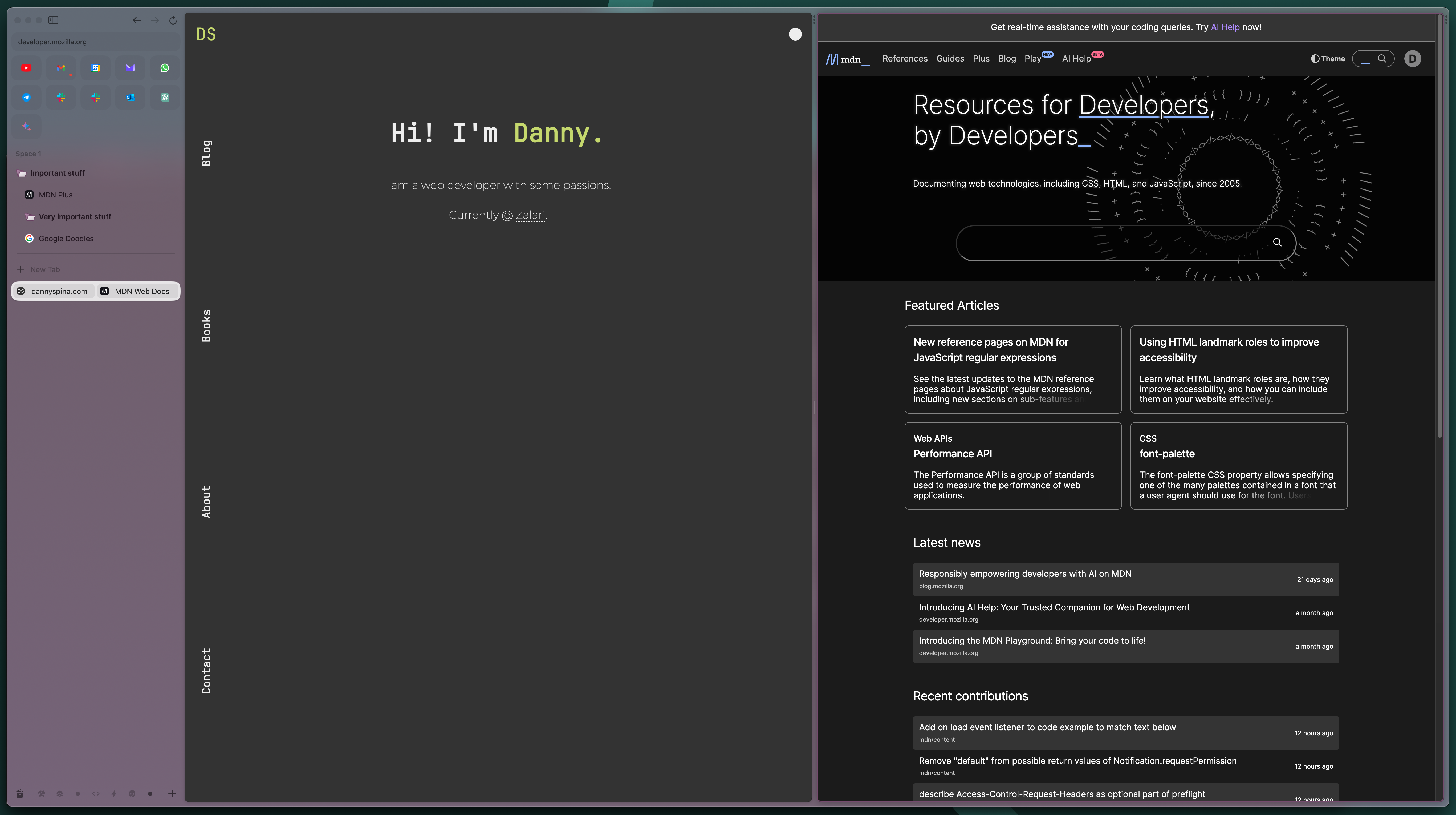
The main area where we view web pages can be split vertically and horizontally to display multiple pages simultaneously.
It’s a sort of tiling but for browser tabs.
Popup View
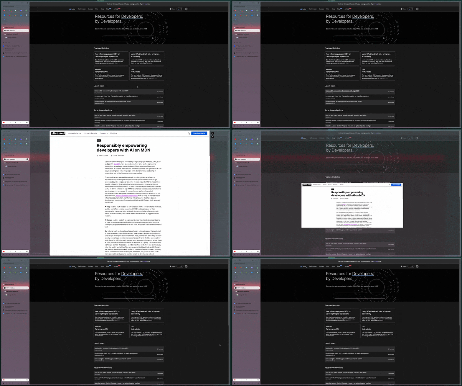
The management of link openings is fantastic. Clicking on a link will open the page in a popup version, without leaving the main web page you were browsing. Then the popup can be closed instantly, or it can be opened in a separate tab.
This preview feature works only within the pinned tabs.
Little Arc
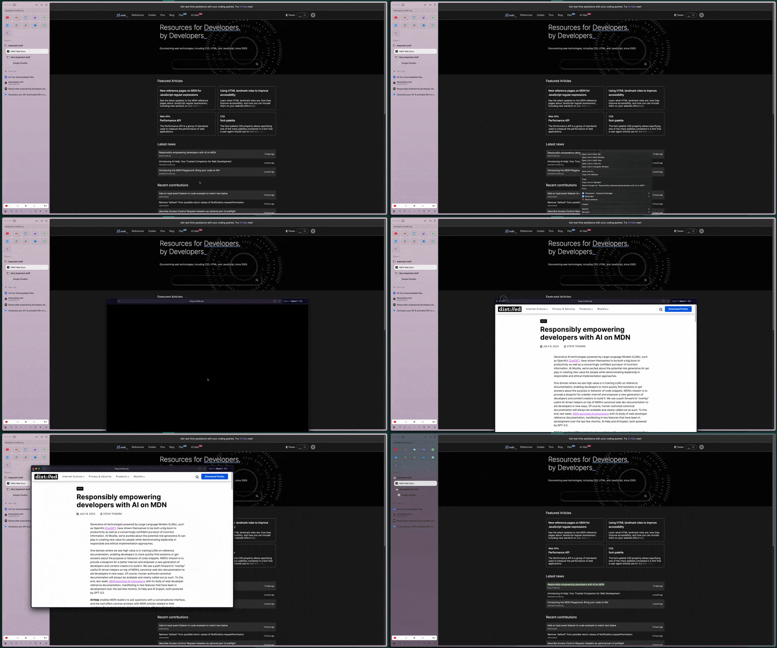
You can also open links and web pages in a new minimal version of Arc, as a floating window with a web page. Then, you can decide whether to transform that floating window into a tab in the current space or another space.
Development Mode
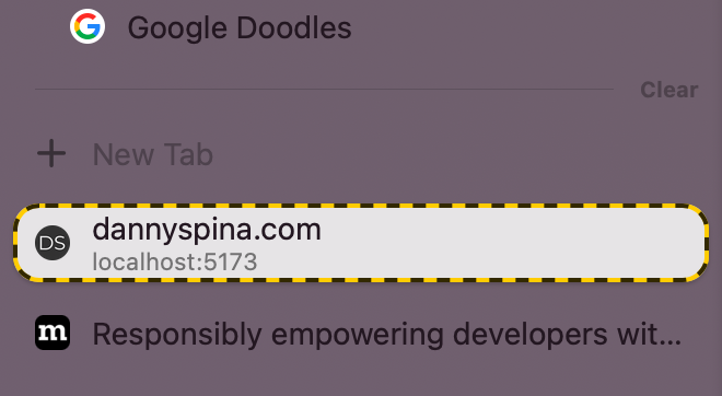
Opening localhost in Arc automatically activates the development mode, providing tools at your fingertips.
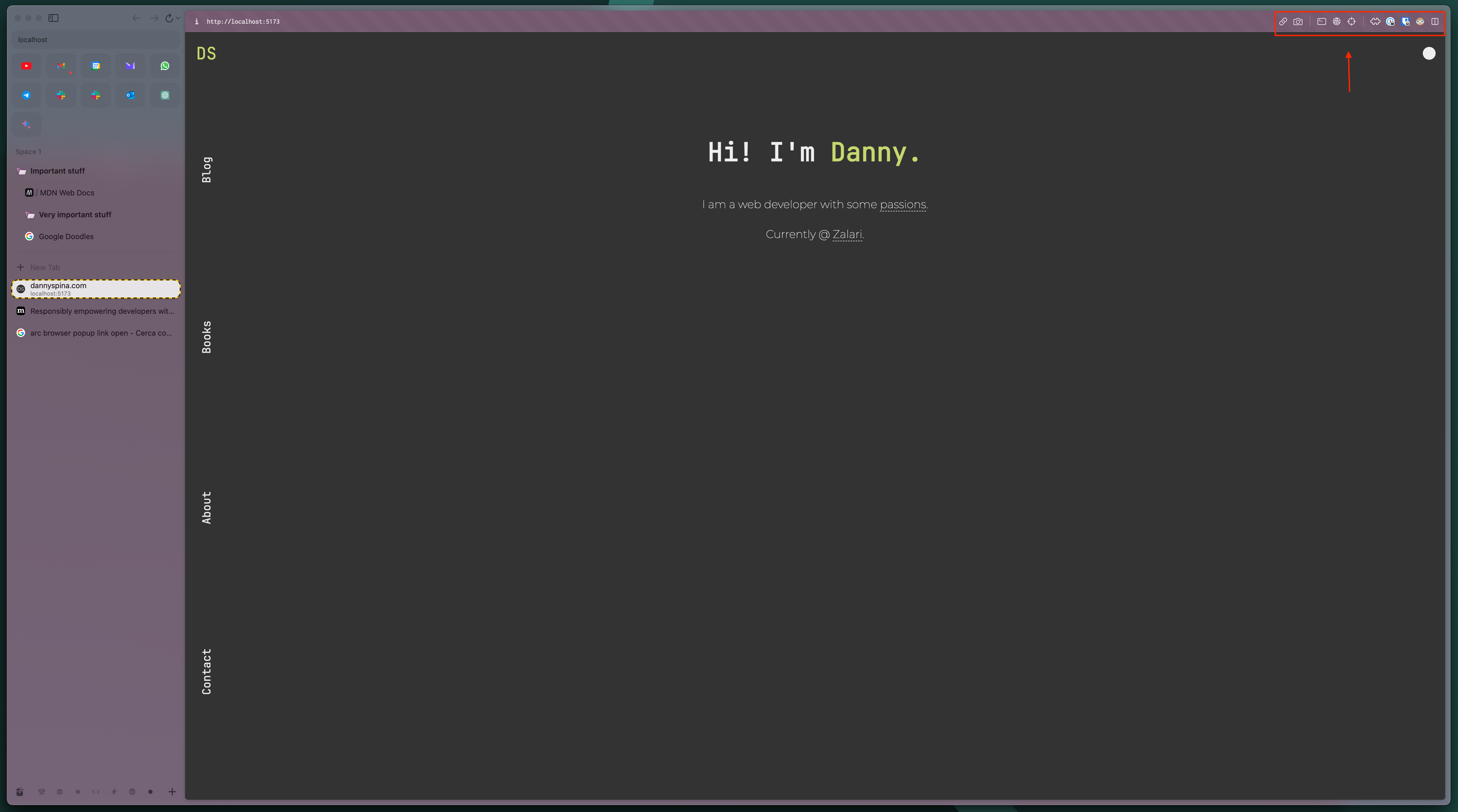
It wasn’t necessarily indispensable, but I appreciated the attention to detail. I must admit I also use the provided tools (though I can open dev tools with a keyboard shortcut, having the icon to click doesn’t hurt).
Picture in Picture
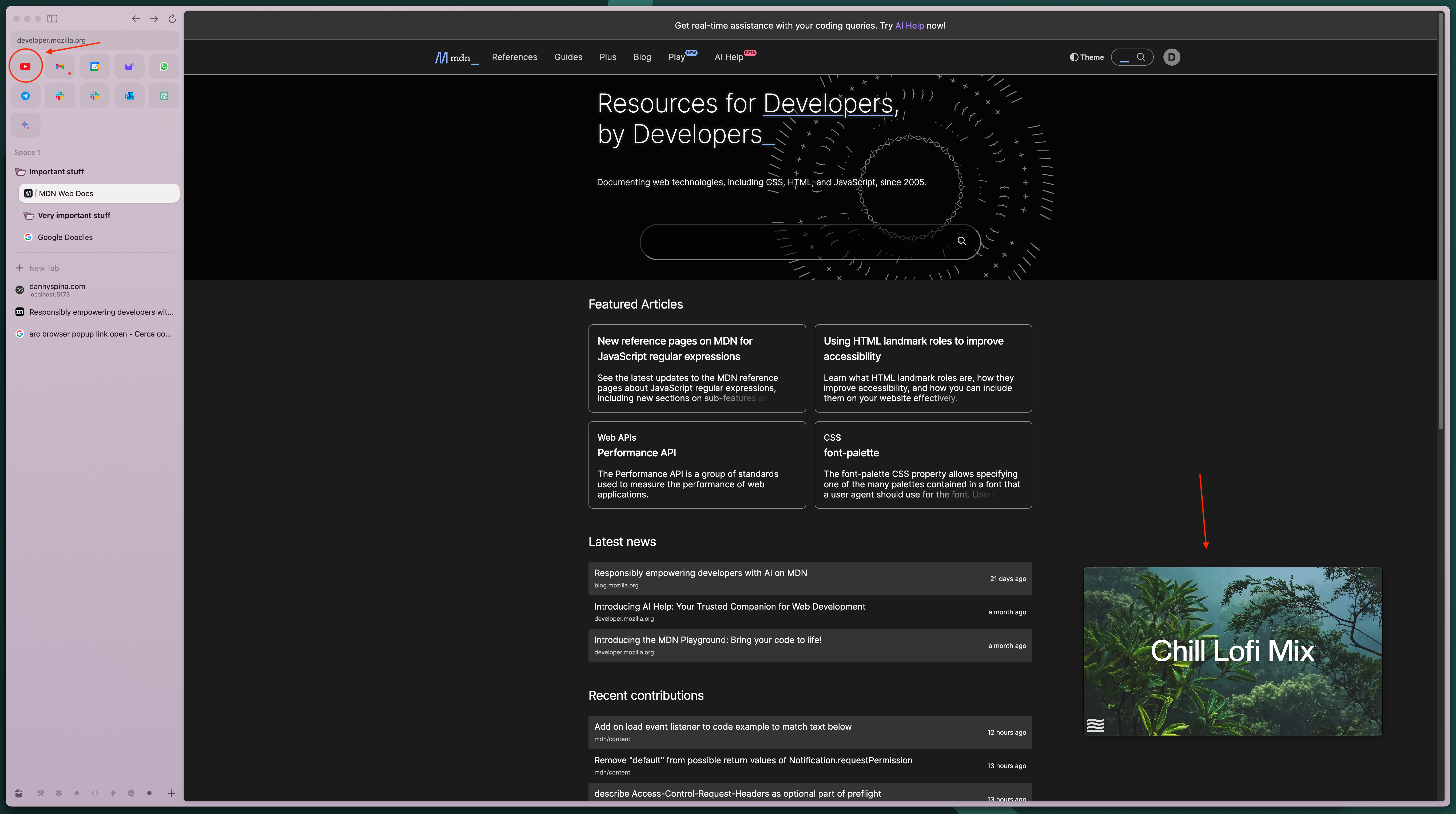
The picture-in-picture functionality works flawlessly out of the box, without having to click anywhere. As soon as you leave YouTube, for example, the PiP appears in a corner and follows you across all desktops or workspaces.
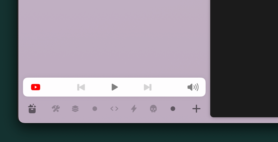
If you minimize the PiP player, this section is added to the sidebar to control the audio. It also works with meetings!
Native or Web?
Arc is based on the idea of using the browser as if it were an operating system. And, to some extent, it succeeds. Thanks to the extremely clean UI and the fact that many native apps are essentially Electron apps that encapsulate the web version of the app, it’s nearly impossible to distinguish between a native app and a web version opened with Arc.
This opens the door to a different workflow, where all the apps are in one place—the browser—without the need to jump from one window to another.
For example, I’ve already stopped using the native versions of Slack and Notion, and I keep their tabs pinned at the top.
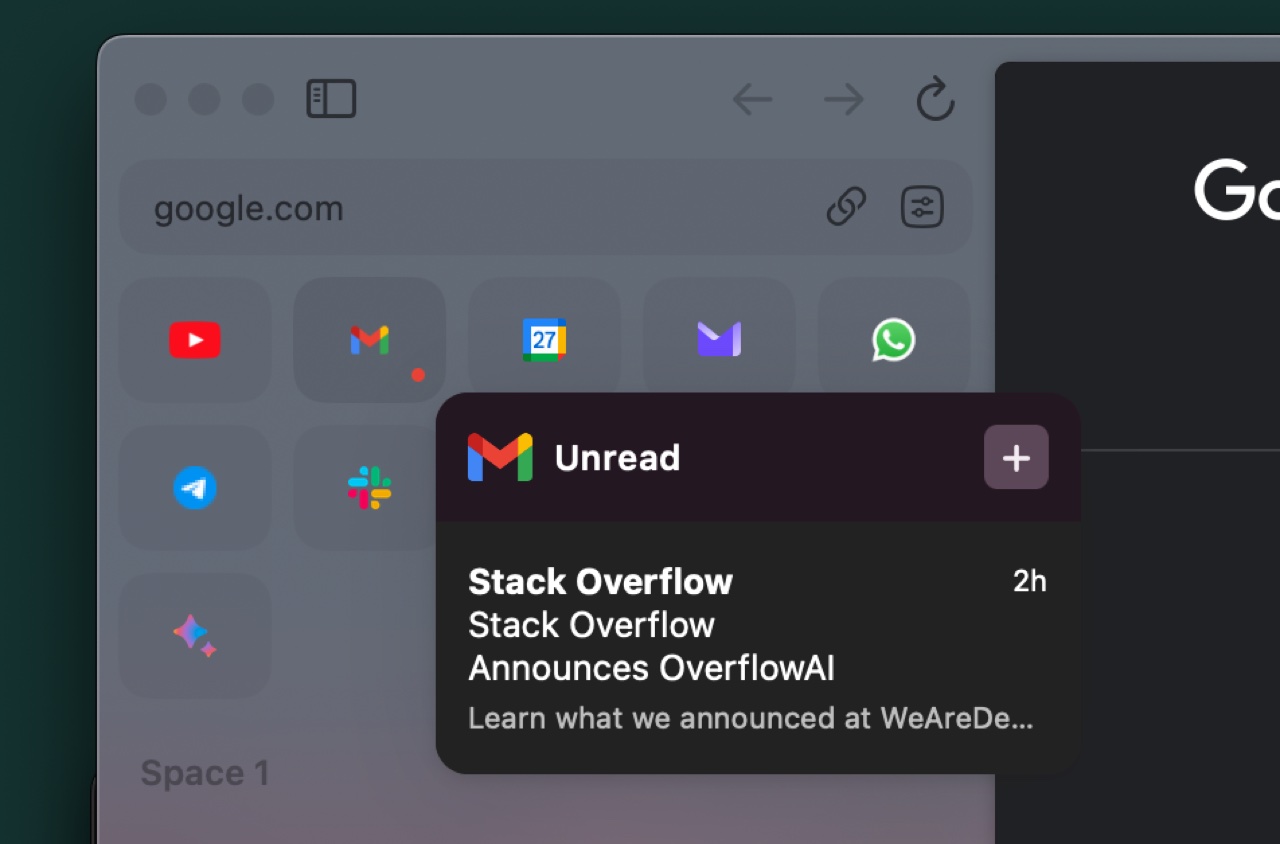
Furthermore, Arc has many integrations that enable quick access to some functionalities of these pinned web apps, which activate on hover.
Version 1.0
Arc was initially available only through invitations from other Arc users. However, now Arc has reached stable version 1.0, and it’s finally available for everyone on their website. [ 1 ] (sidenote: I love the design of their website.)
Since I tried it, I haven’t stopped trying to convince everyone I know to give Arc a try.
At least for me, it has delivered on its promise: it has revolutionized the way I use the internet.