Embracing the light theme
I found myself reconsidering the light theme, here are my thoughts about it and why
Thursday, July 27, 2023
I’ve always dismissed the light mode. I’ve chuckled at memes about light mode users and the potential retina damage from coding with a light-themed IDE.
However, perhaps I’ve had a change of heart.
It all started when I began using a wallpaper created by Arun [ 1 ] (sidenote: I already wrote about him.) .
He’s a designer [ 1 ] (sidenote: I highly recommend reading his blog and subscribing to his newsletter; they are always very insightful and well-crafted.) , who’s passionate about Apple and has designed these wallpapers specifically for iMac.

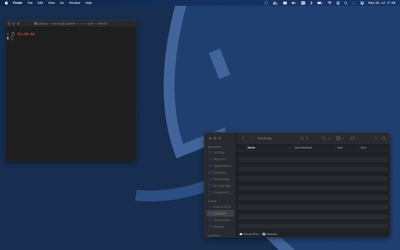
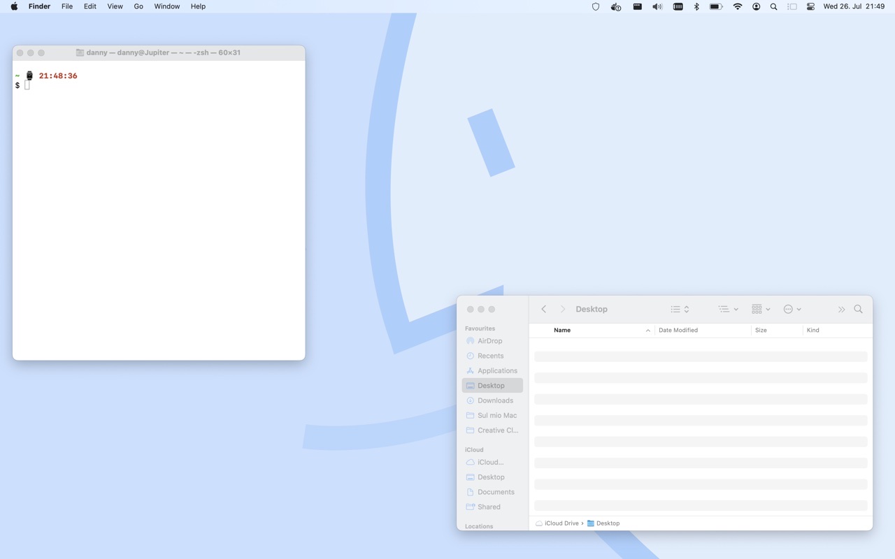
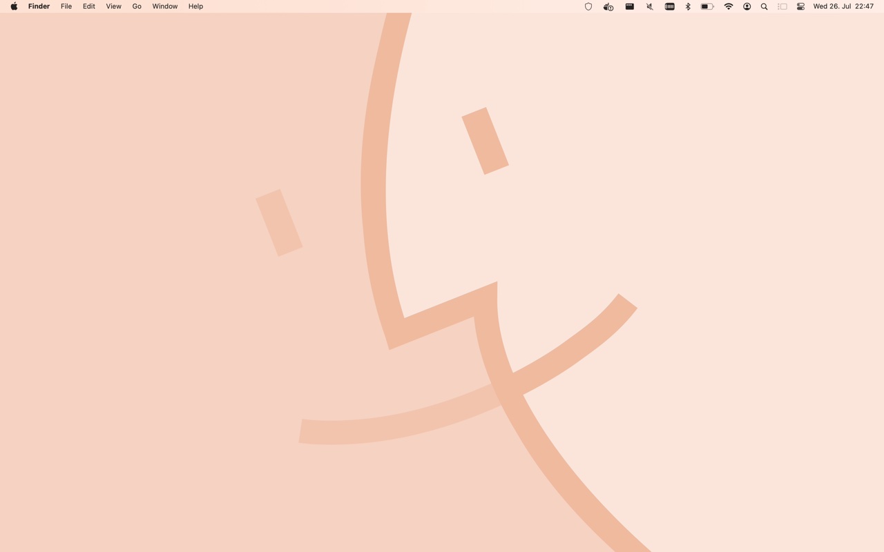
These wallpapers feature a stylized face of the Finder icon in various colors, and he even created a dynamic version.
Lately, as I’ve been reading his posts, my passion for design has reignited, and I find myself paying more attention to the objects around me, the UIs I come across and use… In short, I’m currently more sensitive to the art of design.
As I used my private MacBook Pro, I couldn’t help but wonder why I should forgo the pleasure of using it in light mode. After all, the light color palette was the standard not many years ago.
I thought about how Apple’s design has been characterized by its light colors, the minimalist charm of white or gray on MacBooks.
And then it struck me: It might be a good idea, to create a clear distinction between my personal and work experiences by switching to a light theme for private use, in contrast to the dark theme I use on my work MacBook Air.
This could serve as a mental switch, enhancing focus and productivity during work with the dark theme, and fostering a sense of mental liberation during leisure time with the light theme. Plus, I’d get to enjoy macOS in both variations.
So here I am, writing on Notion in light mode, and this is now my desktop.

I haven’t opened VSCode yet, so I’m uncertain if I’ll be able to write code with the light theme. Nevertheless, I’ll certainly give it a try for a while. After all, I spend eight hours a day in front of a dark-themed IDE, so programming for a few hours a week with a light theme should prove an interesting change.
The Impact of Light Mode on Eyes and Sleep
As I delved into the history of dark/light mode in UI design, I also stumbled upon information about the benefits of each theme.
Setting aside the exaggerated claims that often attempt to sway people towards one theme or the other [ 1 ] (sidenote: dark mode doesn't necessarily conserve battery life; it depends on your screen type (OLED) and the color of dark pixels. If it were a dark gray rather than pure black, the battery benefit would be negligible.) , there are some aspects worth considering.
One such aspect is the impact of using a light theme in the evening.
It’s a well-established fact that screen exposure before bedtime can significantly affect sleep and even lead to migraines.
(sidenote: In reality, it’s best to avoid screen exposure altogether a couple of hours before bedtime, irrespective of the theme used.)
This new piece of information has somewhat dampened my enthusiasm for using the light mode on my personal laptop, especially since I’ll primarily use it in the evenings, right up until bedtime [ 1 ] (sidenote: I'm aware it's not the healthiest habit.) .
Another concern with light mode is that the white light emitted by monitors contains a higher proportion of blue light compared to dark mode, and blue light is a primary disruptor of melatonin production, consequently affecting sleep.
To mitigate this, I’ve activated the night mode, which should reduce blue light by shifting the monitor towards a warmer white.
In connection with this, I’ve also changed the color of the wallpaper.

The History of Dark Mode
As a final note, allow me to share what I’ve discovered (though not much) about the history of dark mode usage.
According to axigen, dark mode isn’t a new concept but rather a trend that gained momentum around 2019 when Apple, Microsoft, and Google started incorporating it into their UIs.
In the 90s, the low-resolution LCD monitors made reading light characters on a dark background quite challenging.
The advent of LED (and later OLED) technology made it possible to implement dark mode without compromising readability.
Looking even further back to the 70s, dark mode was the norm for computers during that era.
Regardless, the adoption by industry giants like Apple, Microsoft, and Google elevated the trend to a standard.
Leaving the Dark Side (for now)
I’ll continue using the light theme on my personal laptop for a while, and then I’ll draw my conclusions. I must confess that when I come across a website with a dark mode, it’s a relief for my eyes 😅 Whether this preference is genuine or influenced by my biases, I can’t say for sure, but either way…
If 70% of coders use dark mode everywhere, there must be a reason.