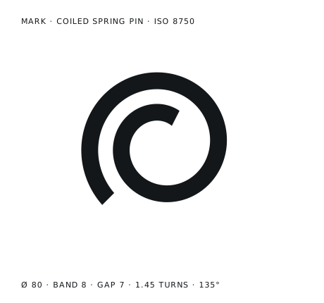
This logo starts from a study. I am not a pure Designer and I think that designig a good Logo is one of the most difficult things a designer can do. Is so easy to design something niche but that do not resonate, or something that is too bloated, or just plain ugly.
I was exploring the work of the Ulm School of Design (where worked Otl aicher, Max Bill and others) and I found the study Otl Acher did on some of the Graphig works he did. They followed the whole idea behind the School of Ulm: the technics will lead the design work.
So, instead of thinking something fancy, I started from the Data.
The Name Problem
For years my logo was DS.
My initials, set in whatever the site font was at the time, in a box. If you are a developer, you know this logo. You probably have it. It is not a design decision, it is the absence of one, and it works fine right up to the moment it doesn’t.
This is the story of what replaced it, and of how the new mark ended up being decided by a pixel grid and the diameter of a milling cutter, and not by me.
The rabbit hole
A while ago I started repairing mechanical cameras again.
“Again”, because it used to be my job. Before I wrote software I was a Nikon repair technician. Then I did an apprenticeship, moved into development, and for years the only thing I opened was a laptop. At some point I missed having a machine in my hands badly enough to clear a corner of the desk and start over.
Not as a business, and not seriously. An experiment. At the moment my entire operation is a Nikon FE and an FM2 sitting on my desk, waiting to be sold.
But repairing something means reading its service manual, and that is where it started. Exploded views. Part numbers. Callouts. Tolerances written right next to the thing they describe. The whole visual language of an industry that had to explain a machine to somebody holding a screwdriver.
I had spent years with documents like these and never once looked at them. When you are using a manual you are hunting for one number and you look at nothing else. Coming back to it after all that time writing software, I finally saw the design.
I got completely lost in it, and from there into industrial design.
Then into interior design, and that one was deliberate. My home office needs sorting out, and I had been putting it off for a while, mostly because I could not say what I actually wanted it to look like.
And somewhere in there something clicked that had nothing to do with cameras.
Finding the name for a taste I already had
I have always liked a certain kind of object and never been able to say why.
It turns out there is a name for it, and I had been circling it for years without knowing: the Ulm School of Design. The Hochschule für Gestaltung, 1953 to 1968, the school that took what the Bauhaus started and swapped the artistic part for method, systems and measurement. Ulm is where Braun’s design language came from. It is the reason a 1970s Nikon and a 1970s Braun radio feel like they were made by the same people, even though they were not.
Reading about it was uncomfortable in a good way, because I recognised my own preferences in a place I had never looked.
I also spent thirteen years in Germany. I suspect that did something to my taste that I only noticed once somebody put a label on it.
Anyway: I now had a name for the thing, and a lot of energy.
The site, and then the problem
So I redesigned my site.
Not because the old one was broken, but because it no longer looked like where my head was. The new one is built on that language: grids, spec sheets, part numbers, a service procedure instead of a list of buzzwords. Archivo and JetBrains Mono. I enjoyed every minute of it.
And then I got to the header, and there it was.
DS.
On a page where every other decision had been made on purpose, the logo was the one element still sitting there as a placeholder. You cannot spend two weeks on a grid and then drop your initials in a box and call it done. It was the only lazy thing left, and it showed.
So, an actual study. And the obvious place to start is the name.
My surname is a machine part
My surname is Spina, and I have never particularly liked it.
I did not go looking for this. It came up in the middle of a long session of throwing ideas at an AI, somewhere between two bad ones.
A spina elastica is a spring pin: the pin that aligns two parts. It comes in two flavours, both standardised:
- the slotted spring pin (ISO 8752), a hollow C-shaped cylinder with a slot running along its whole length
- the coiled spring pin (ISO 8750), rolled from a thinner strip into a spiral
Both work the same way. Their outside diameter is slightly larger than the hole, so they compress when you drive them in and hold by pushing outwards, permanently.
They hold because they are not closed.
The slot is the tolerance that lets the pin grip. I stared at that sentence for a while.
The mark is a function
I wrote the mark instead of drawing it.
It is a small piece of code, spina(turns, band, gap), and every version of the logo is that function with different numbers. Zero turns gives you the slotted pin. Add turns and the strip wraps into a spiral.
This sounds like showing off, but it is the only reason the rest of this post exists. A drawing you can only look at, you can only have opinions about. A drawing you can generate, you can test.
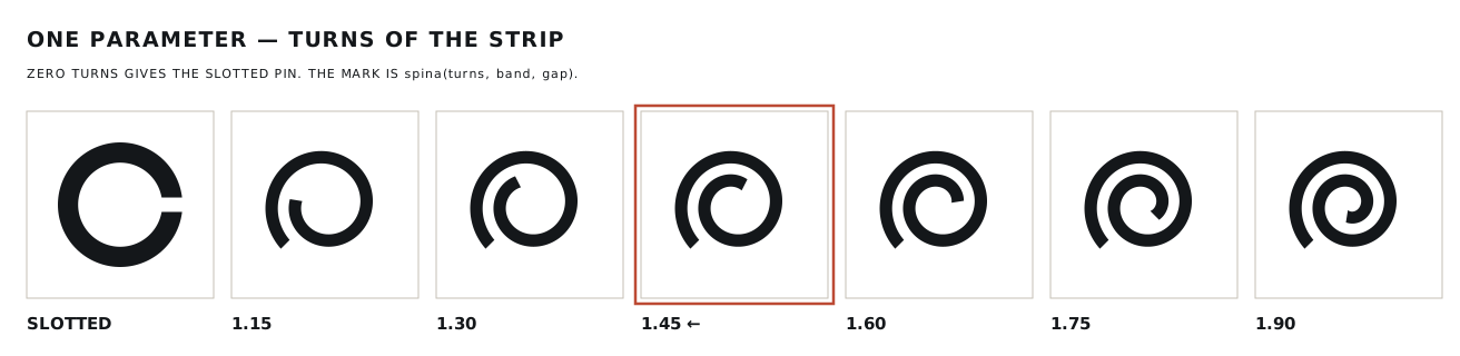
I froze it at 1.45 turns.
A real coiled pin has about 2¼ coils. Mine has 1.45. The pixels won that argument, as you will see.
The duck
At small sizes, my very serious mechanical mark looked like Donald Duck.
The step where the strip ends reads as a beak, and the gap between the coils becomes an eye. Once you see it you cannot unsee it, and if I could see it, so could everybody else.
I think there is a rule here. Every mark has secondary readings and you cannot get rid of all of them. The Nike swoosh is a check mark that means nothing. The FedEx arrow is famous precisely because nobody notices it. So you keep the harmless readings and kill the ridiculous ones.
A duck is ridiculous. The duck had to go.
The fix was rotation. I generated the same mark at eight angles and looked at every one of them at favicon size. A face needs a horizontal mouth, and on a diagonal the beak has nothing to sit on.
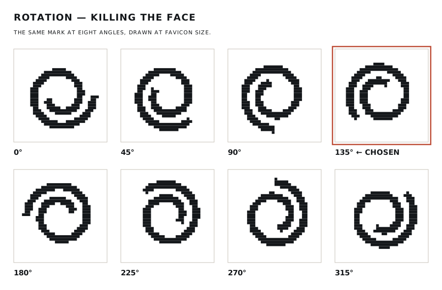
135° it is. As a bonus, at that angle it reads a little like a d.
So after all that, I am back to my initials. Just not written down.
Something I could count
“Does it still look good at 24 pixels?” is a question about taste. You cannot iterate on taste, at least I cannot, and I had four candidate geometries and no way to choose between them.
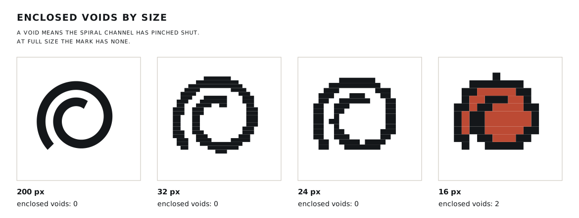
So I looked for something countable, and topology gave it to me: count the enclosed voids.
An enclosed void is a pocket of background that no longer connects to the outside. At full size my mark has zero of them. The channel of the spiral is a single groove that runs from the outside all the way to the centre. It is open.
Which means every enclosed void that appears as the mark shrinks tells me one exact thing: the channel has pinched shut. That is the moment the spiral stops being a spiral and becomes a ring.
Enclosed voids, by size:
| geometry | 200 px | 32 px | 24 px | 16 px |
|---|---|---|---|---|
| base | 0 | 0 | 2 | 3 |
| narrow gap | 0 | 6 | 5 | 3 |
| thick band | 0 | 0 | 3 | 4 |
| wide gap | 0 | 0 | 0 | 2 |
| slotted | 0 | 0 | 0 | 0 |
Two things came out of this.
The first is that “narrow gap” collapses at 32 px, and it was the variant I liked most. It is also the one closest to the real component, because in an actual coiled pin the coils touch. Beautiful at 200 px, first to die.
The second one is worse.
No spiral survives at 16 pixels. Not even the best one.
Two pins, not two logos
I could have simplified the mark until it survived. Instead I went back to the catalogue, and found that the component had already solved my problem.
SPIROL, who manufacture them, put it like this: a slotted pin can only flex so far before its gap closes and it effectively becomes a stiff, solid tube.
That is exactly my failure mode. The real part and my drawing of it break in the same way, for the same reason. I had accidentally rediscovered a mechanical property of the thing I was drawing.
So I stopped inventing and took the rule from the catalogue:
≥ 24 px → coiled pin. ≤ 16 px → slotted pin.
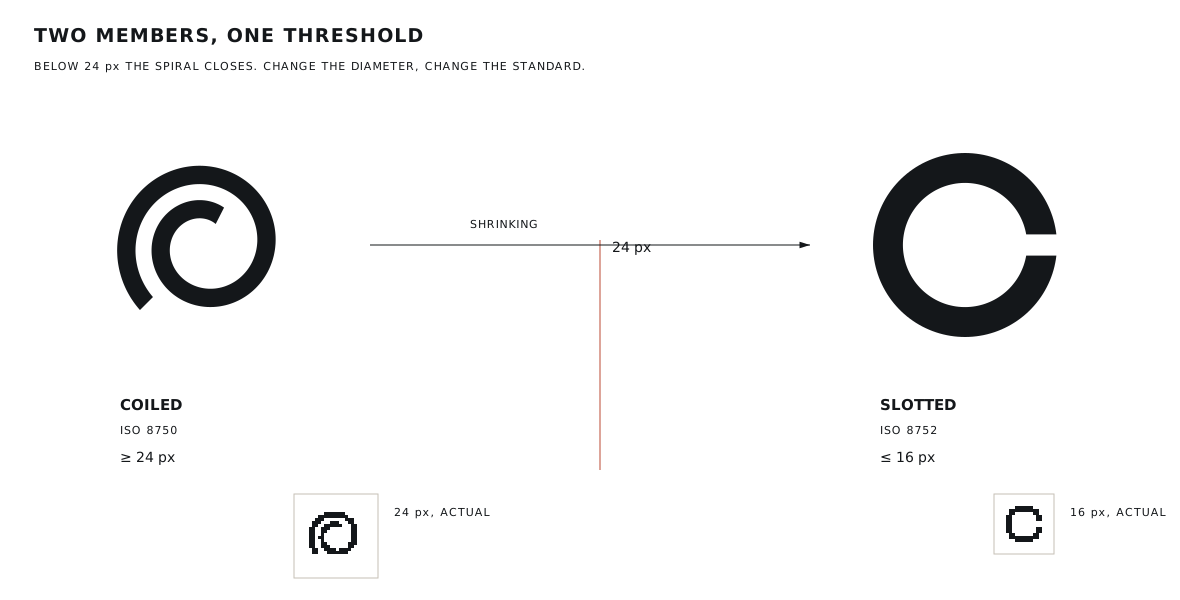
Change the diameter, change the standard. That is how spring pins work, and now it is how my logo works.
The winner for the coiled version is “wide gap”: band 8, gap 7. Less faithful to the real part, and the only one that reaches 24 px intact. A logo is not a production drawing.
From pixels to metal
The screen is not the only thing that asks “how small?“. The tool asks too, and there the answer is arithmetic.
The smallest feature in the mark is about 6.5% of its width. So the minimum size is the tool diameter divided by 0.065:
| process | tool | min. mark |
|---|---|---|
| milling | 1.0 mm | 15.4 mm |
| milling | 0.5 mm | 7.7 mm |
| photo-etching | 0.2 mm | 3.1 mm |
| laser | 0.1 mm | 1.5 mm |
| steel punch | 0.05 mm | 0.8 mm |
I got this wrong the first time. I had written down a single threshold, 16 mm, and treated it as a property of the logo. It is not. It is a property of a 1 mm end mill. With a laser the spiral holds below 2 mm.
Not a big mistake, but a useful one: I had turned one measurement into a law.
What the machine could not do
I did all of this with an AI.
The geometry was generated as code and checked with numbers: areas, bounding boxes, enclosed voids, whether the pattern tiles without gaps. That worked well. Halfway through, the image rendering broke and the work continued blind, on measurements only, for a few hours.
But every decision that mattered was mine, and visual.
The duck was mine. The d was mine. So was “this one is nice but it does not resonate with the name”, which is not a measurable statement and was correct.
And at one point the machine told me, with total confidence, that the narrow gap variant died at 16 px. When I measured it, it died at 32. Right direction, invented number. Confident guesses are cheap, mine included. That is what the counting was for.
Measurement replaces taste only where taste was an opinion in disguise. Everything else is still the eye.
Where it ended up
Final numbers: Ø 80 · band 8 · gap 7 · 1.45 turns · 135° · one colour.
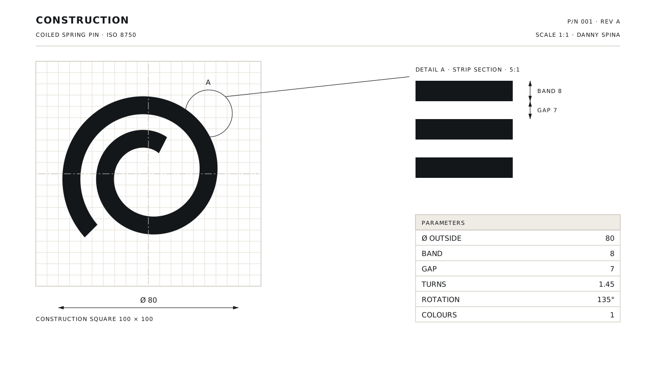
The mark is now in the header of this site, where the DS used to be. It says nothing: no letters, no name, no picture of a camera.
I have a name in my head for the repair side, and two cameras on the desk, and no idea yet whether any of it becomes a real thing. A mute mark does not force me to decide. It works as the logo of a freelance developer today, it would work on a box tomorrow, and it does not look silly either way.
Which is roughly what the component does.
It holds because it is not closed.